Branding
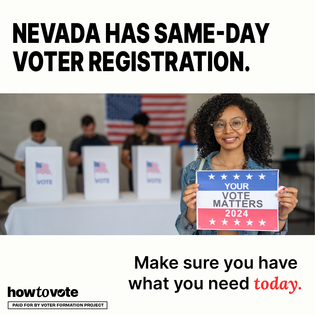
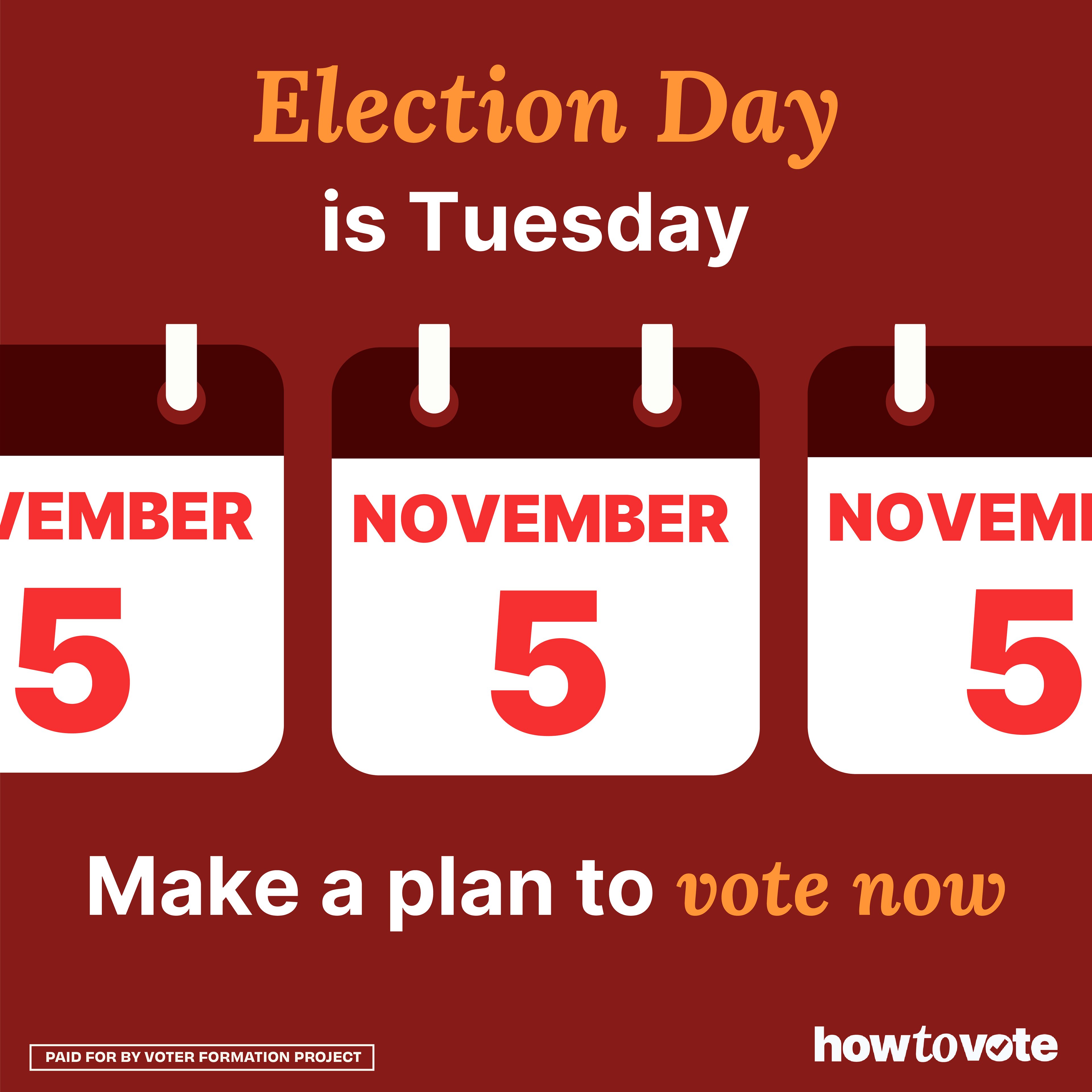
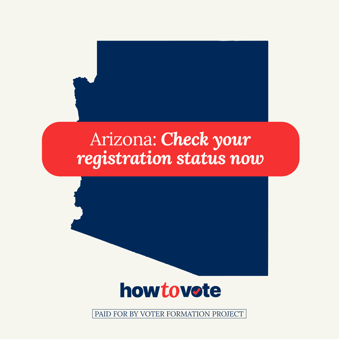
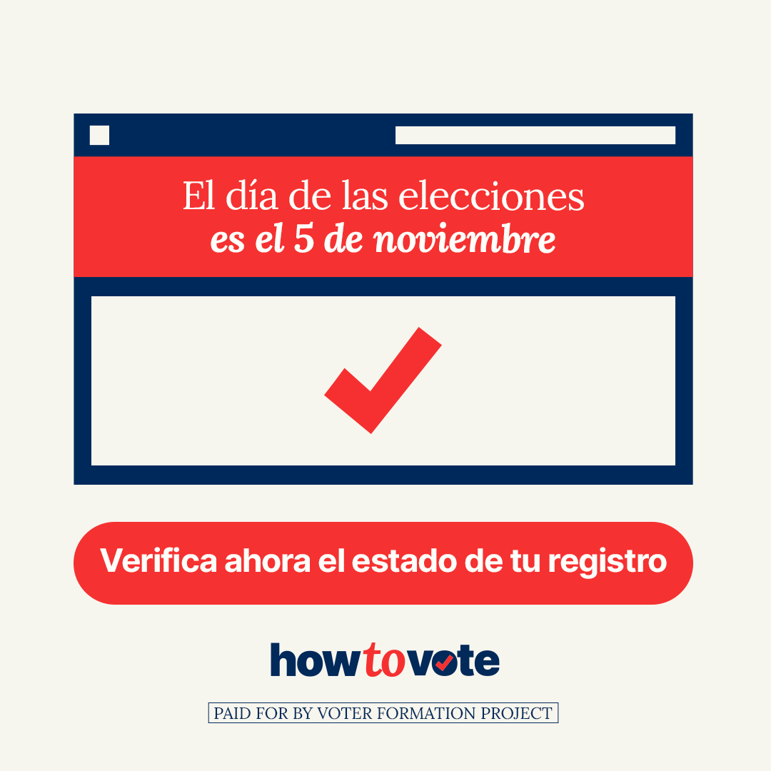
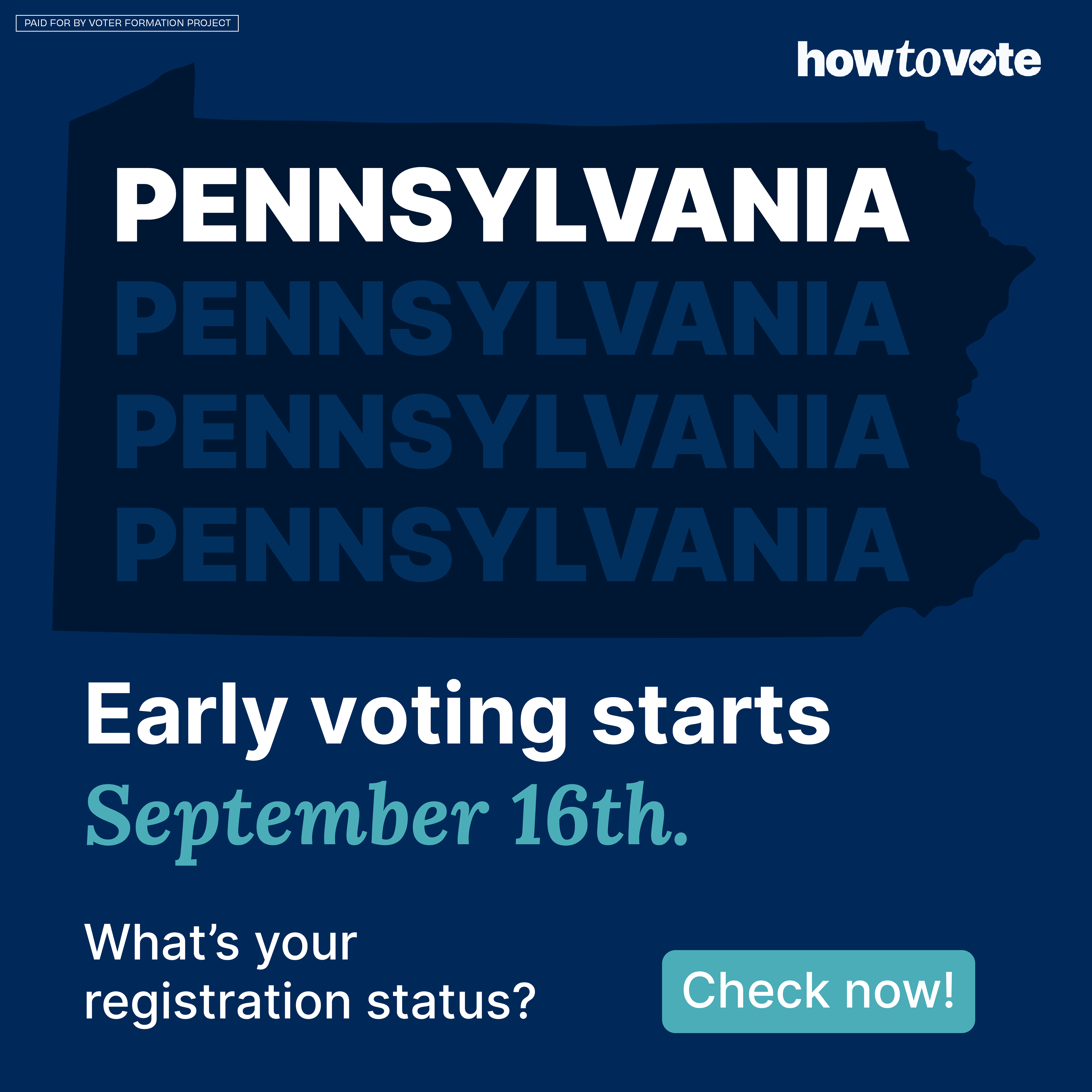
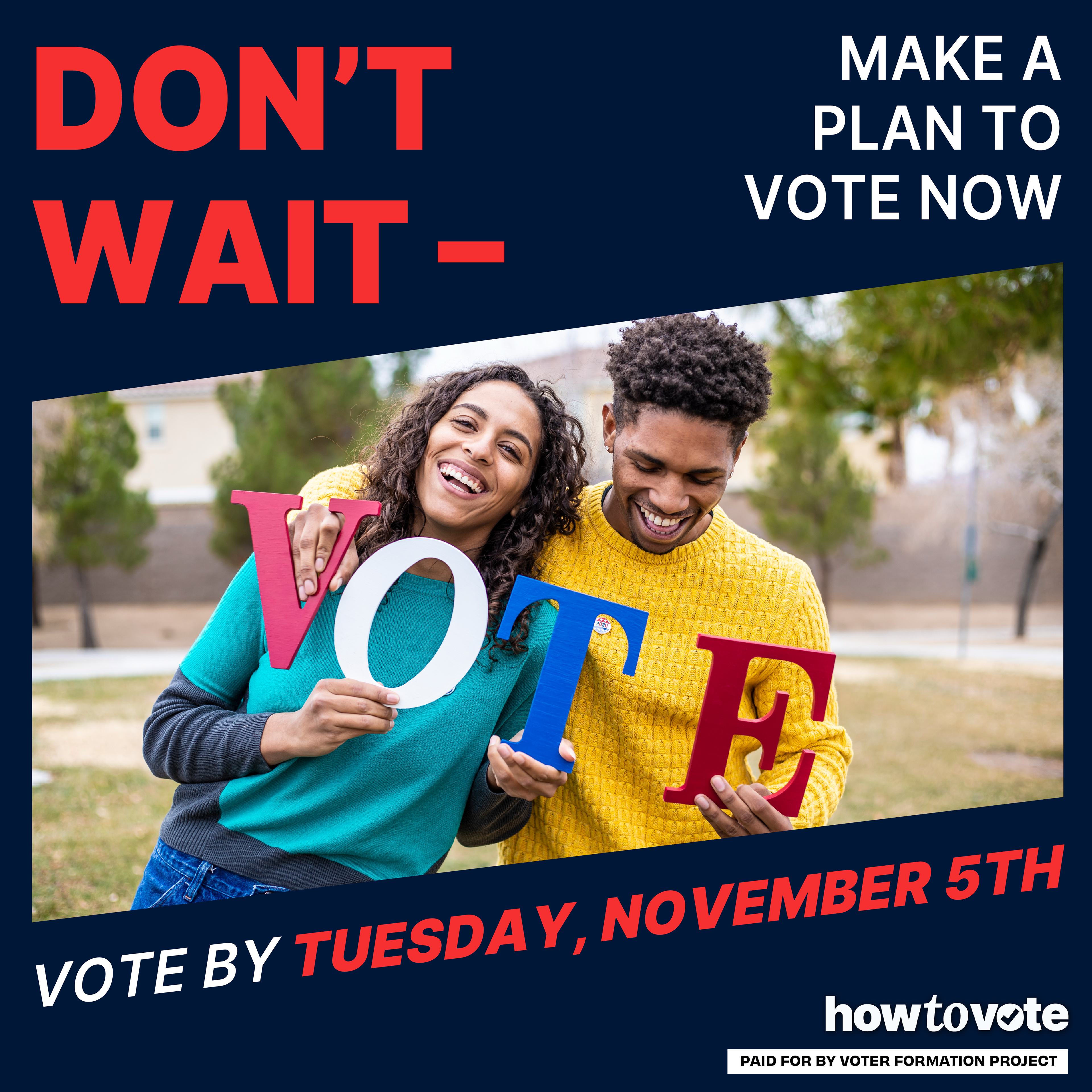
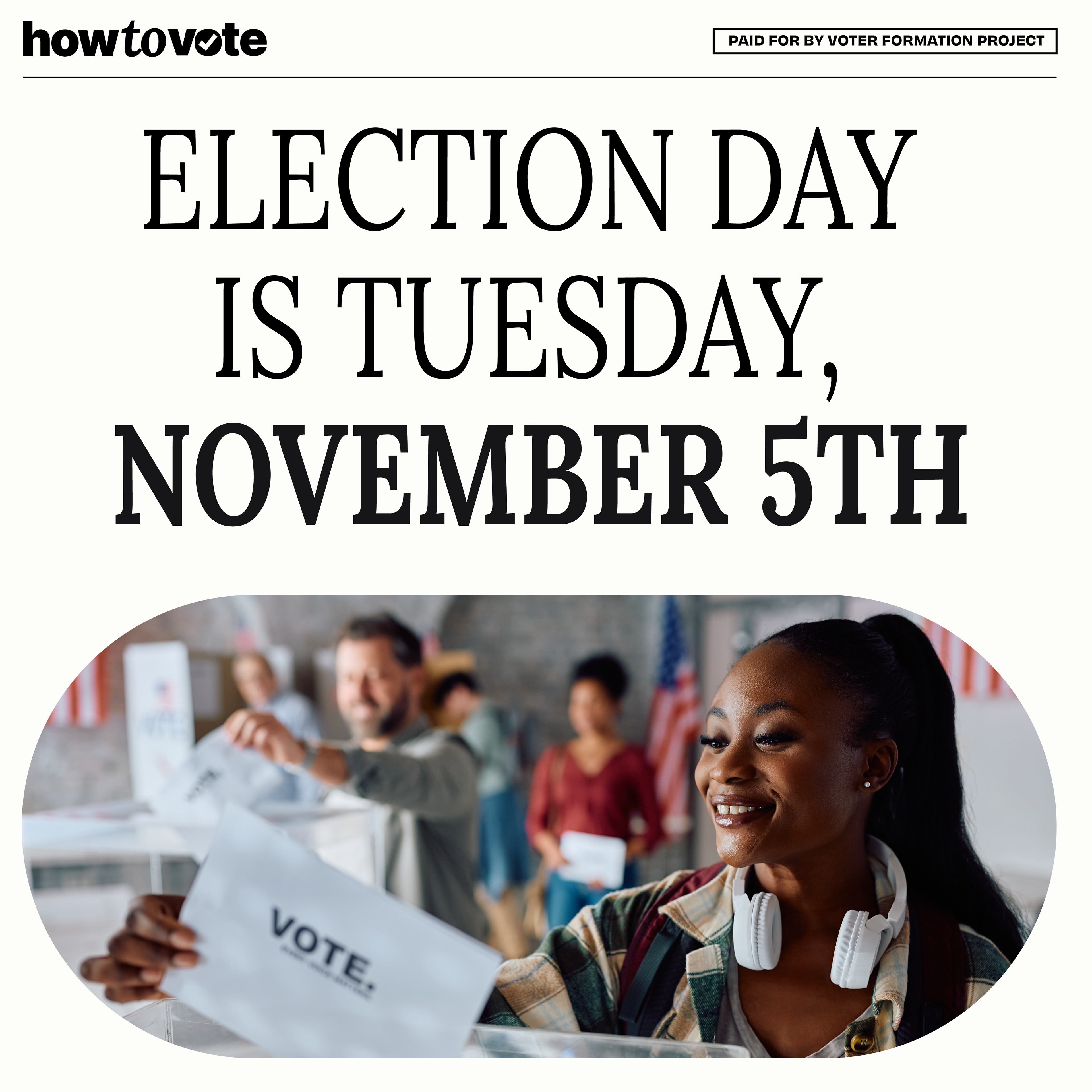
This brand was developed as a companion to the Voter Formation Project (VFP) brand. While VFP centers Black and Brown communities to ensure they feel seen and represented, the How to Vote brand focuses on the mechanics and logistics of the voting process. The How to Vote brand also served as the primary driver of conversions as we got closer to election day. The goal was to evoke the look and feel of a government agency providing essential voter information—clean, trustworthy, and informative.
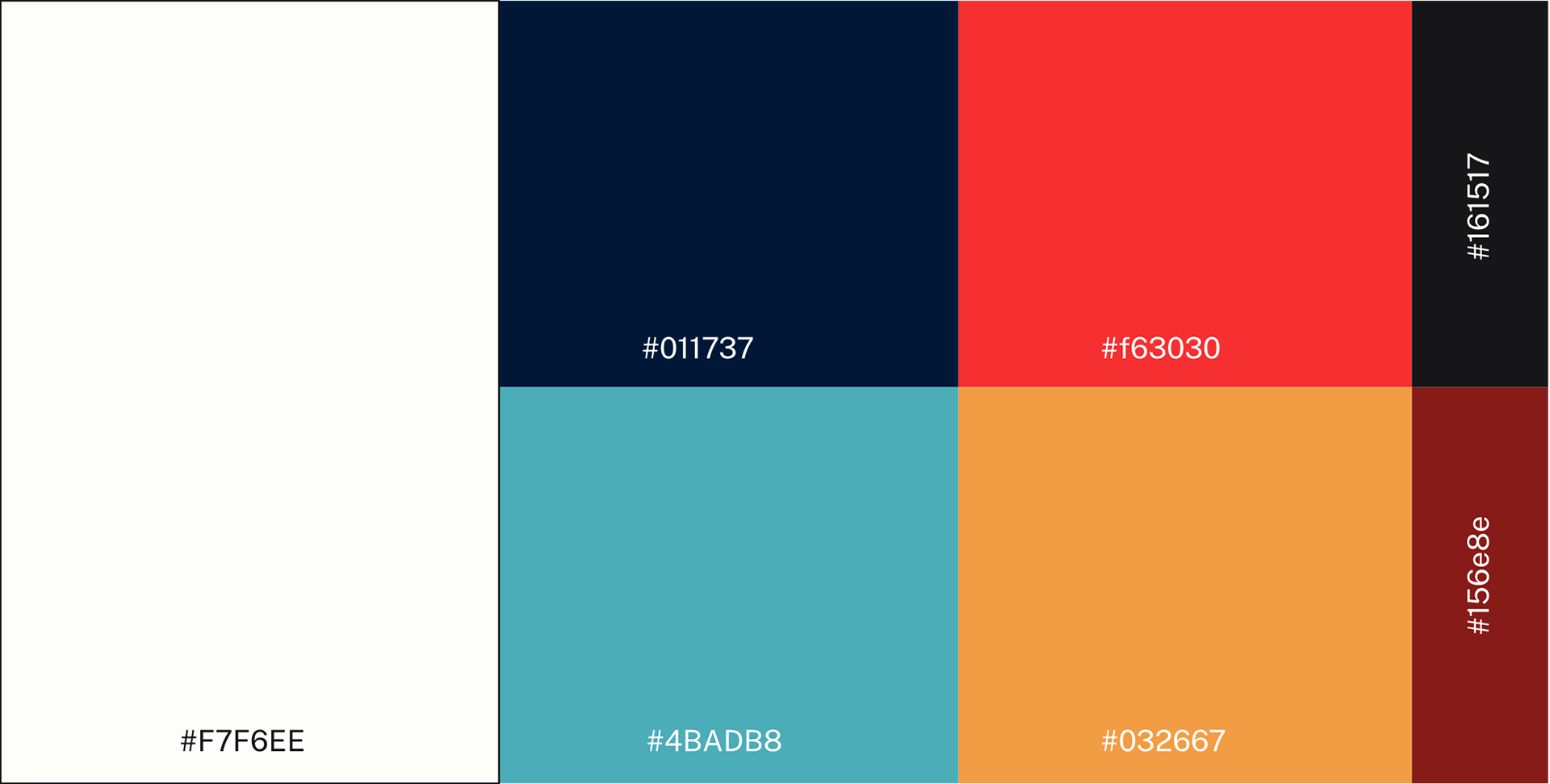
We modernized the visual identity while maintaining a straightforward, instructional tone. For typography, we paired a clean sans-serif with a serif reminiscent of Times New Roman to create a balance between clarity and authority. The color palette nods to traditional patriotic themes with red, white, and blue, while incorporating a few unexpected tones to help the brand stand out from conventional civic design.
During the mobilization phase of our programming we ran mostly How To Vote ads for our graphic assets. Overall our ads engaged 300,000 people in across three states. More than 10,000 people used our organizations website to create a voting plan, with many more relying upon our website for critical voting information.
Old Logo
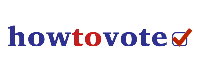
New Logo

Color Scheme
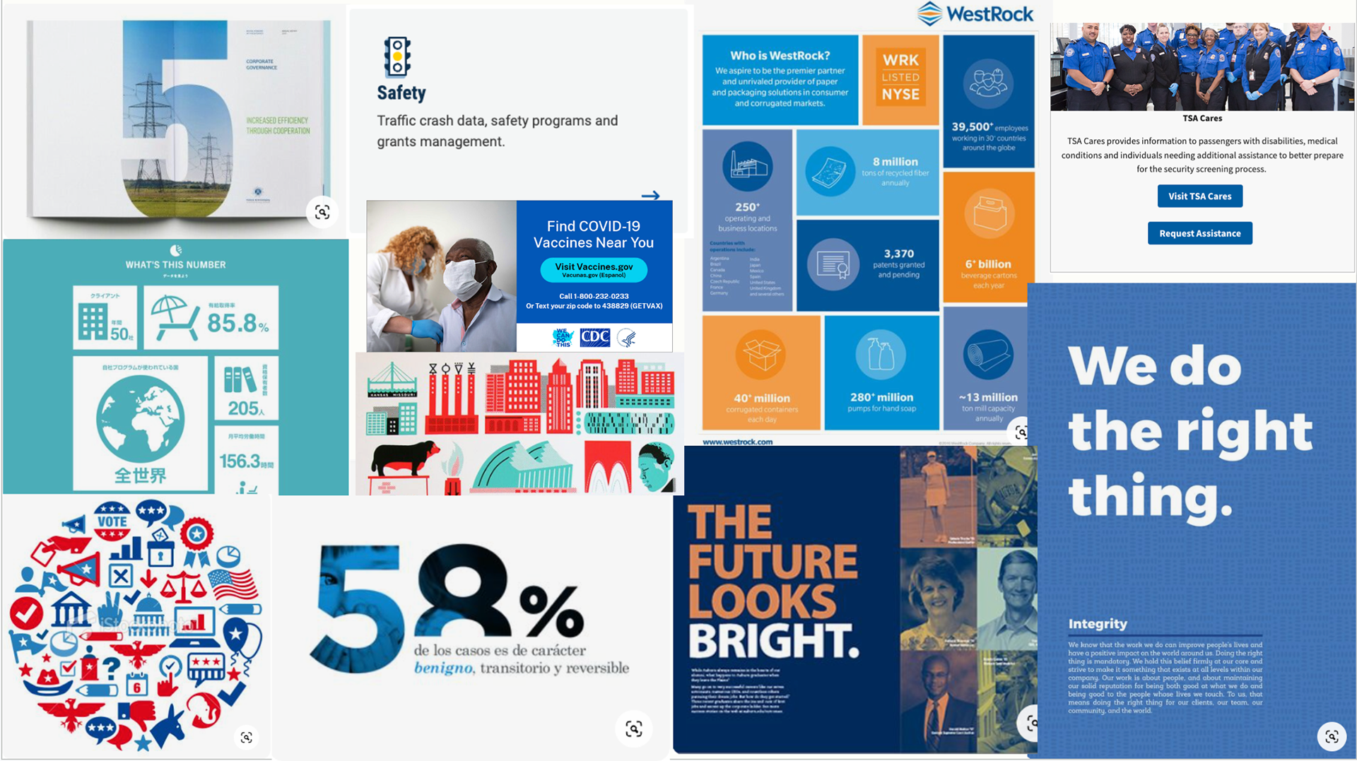
Sample of Creative Products


Graphics by Tiarra Lucas & A'lysia Alcorn