Branding
The Voter Formation Project’s brand is designed to center Black and Brown communities, ensuring they feel seen and represented in our creative work. Organizational research showed that when people saw themselves reflected in the content, they were more likely to engage—boosting awareness around voting and civic participation.
Our challenge was to build a brand that made people want to be civically engaged even when they are exhausted (and rightfully so) by the current political environment.
To bridge the gap between traditional civic messaging and ow Black and Brown communities consume content we wanted to do the following in our rebrand:
Create a brand that feels familiar to our audience — positioning civic engagement as a natural, everyday part of life, just like any other content they enjoy consuming.
Center the style & creativity of the audience we're talking to. Our brand had to feel current and culturally relevant, both visually and in its overall design approach.
Improve ADA compliance to ensure accessibility and inclusivity across all touch points.
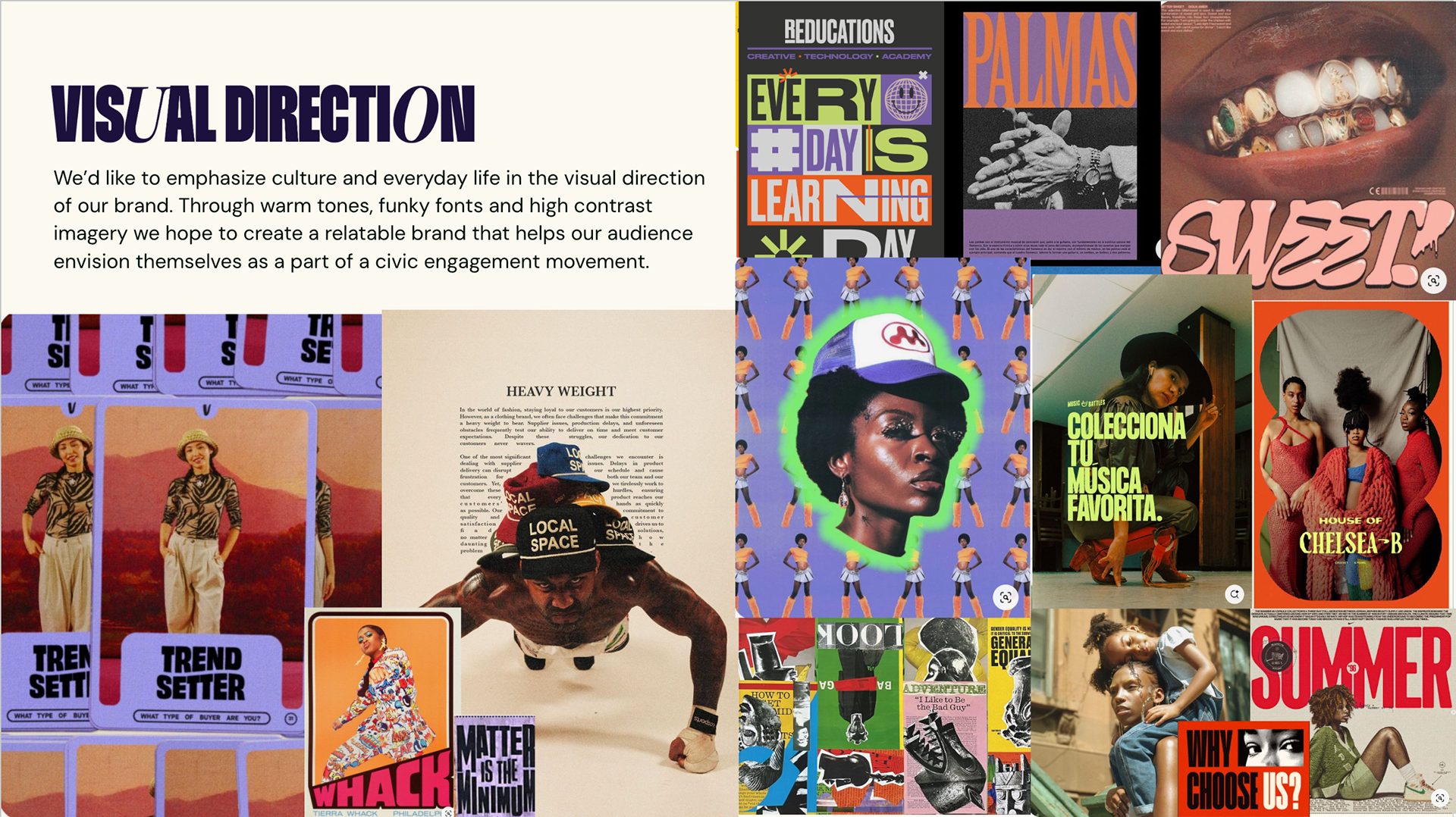
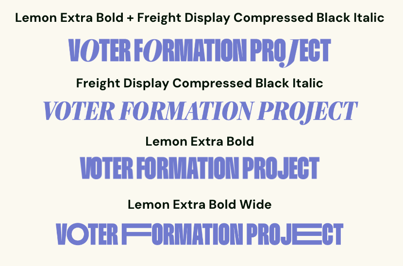
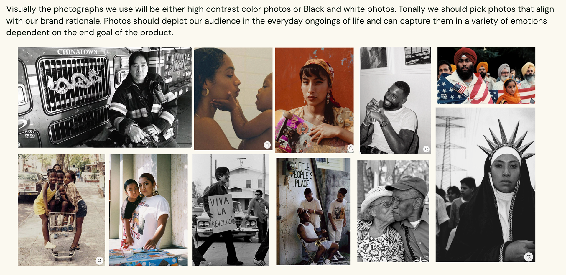
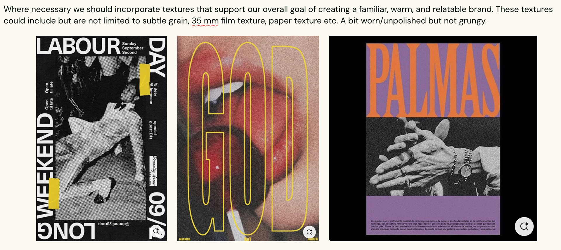
For typography, we embraced bold, playful fonts that could be combined in creative ways to grab attention—especially for topics that might otherwise feel routine or overlooked. Similarly, we selected a vibrant mix of primary and secondary colors to ensure the brand remains visually engaging while allowing for flexibility and variety in design. When it came to photography, authenticity and depth were essential. We aimed to create visuals that feel relatable and real—making the brand not only appealing to Black and Brown audiences, but also reflective of their experiences and identities.
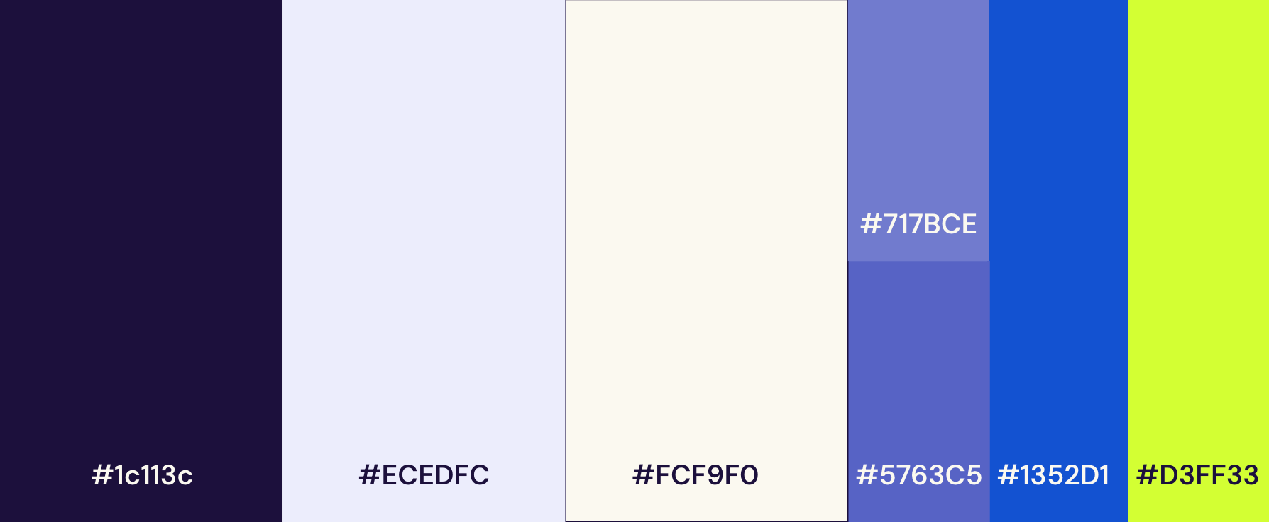
This color scheme was considered primary. The emphasis on the purple was a nod to the present VFP brand and multiple shades were included to ensure ADA compatibility.
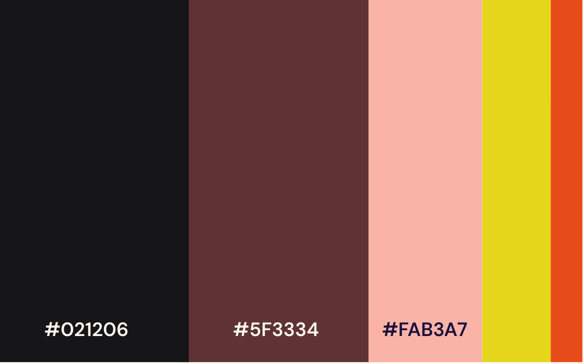
These shades were secondary colors to be used by the designers for flexibility and combined with primary colors for consistency.
Graphics by Tiarra Lucas & A'lysia Alcorn