Why A Rebrand?
When I joined the Voter Formation Project, the organization already had an established brand, but the paid digital advertising didn’t fully align with that identity. While the team valued flexibility in design to optimize creative performance, I wanted to ensure that we could also maintain consistency. The challenge was to create branding that allowed flexibility while also maintaining brand consistency.
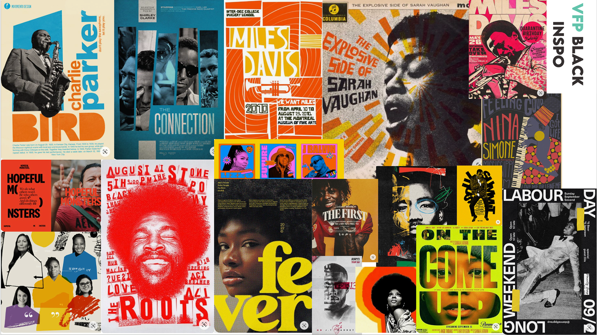
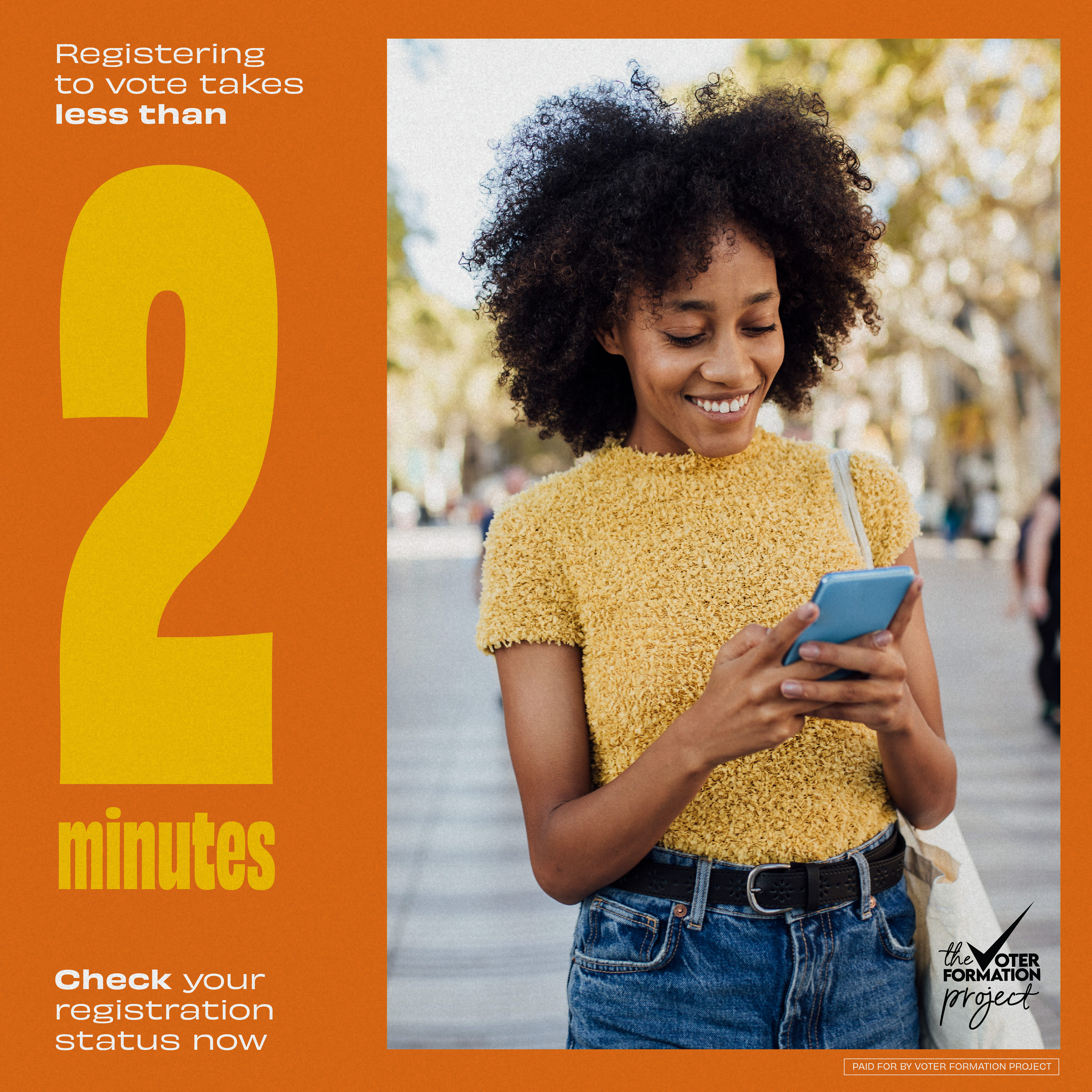
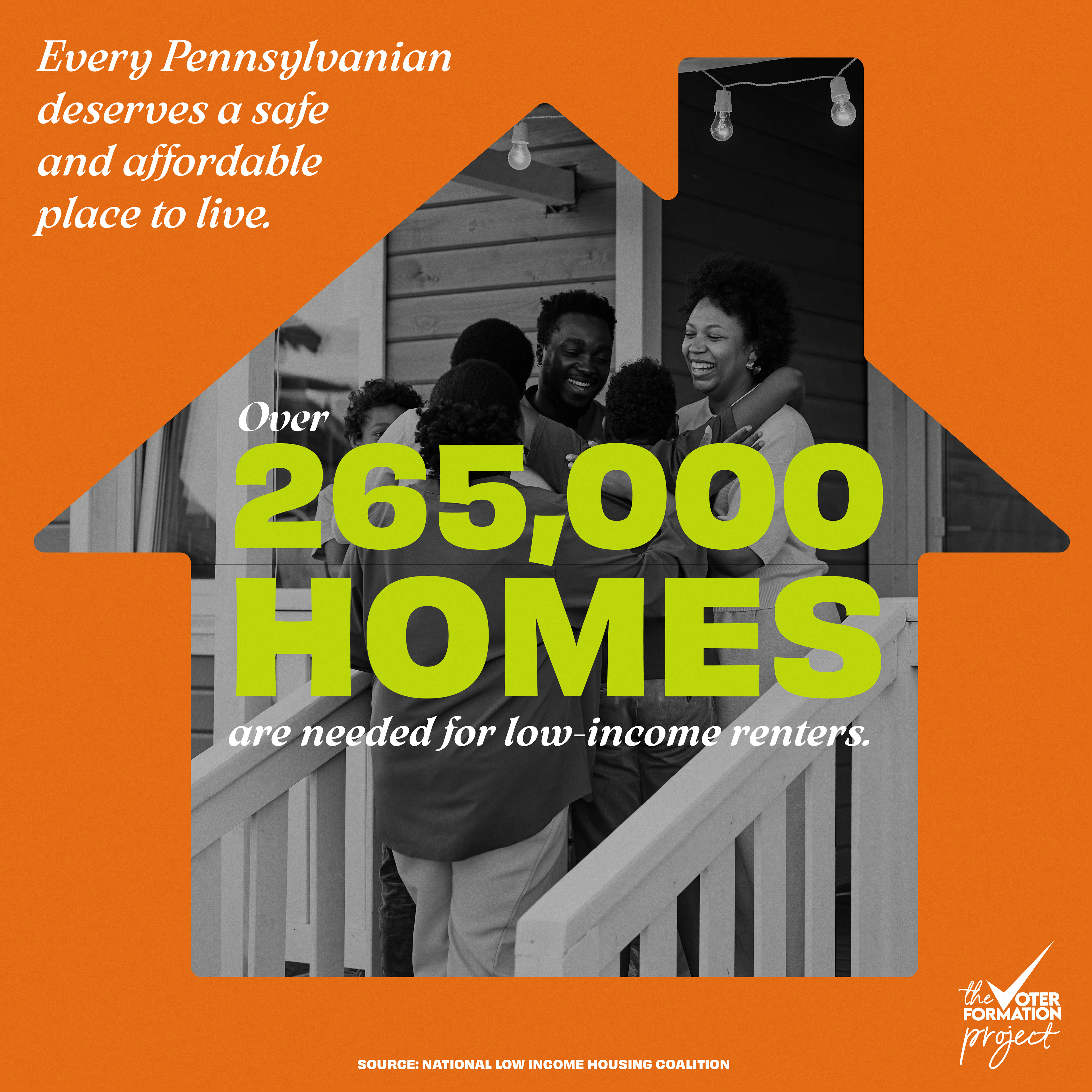
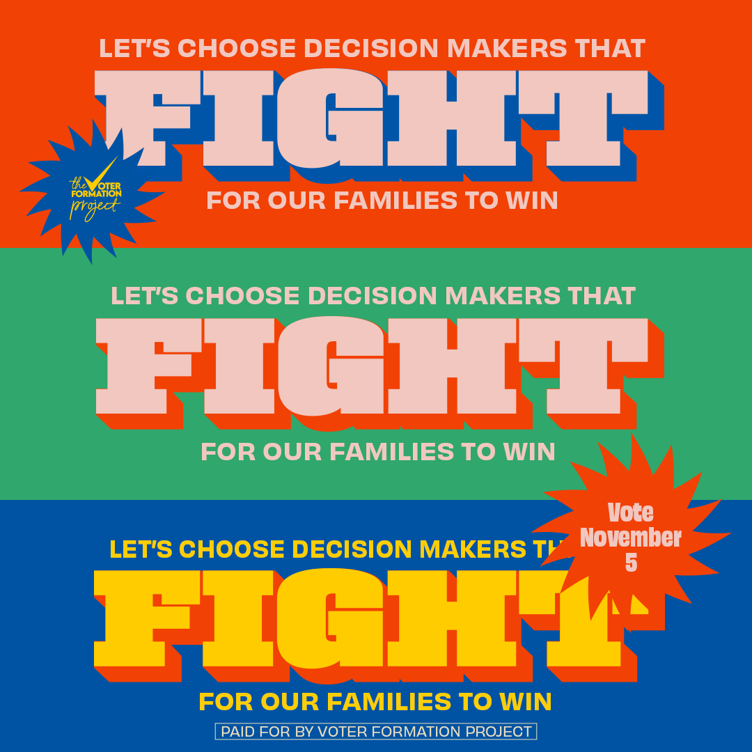
Speaking to a black audience
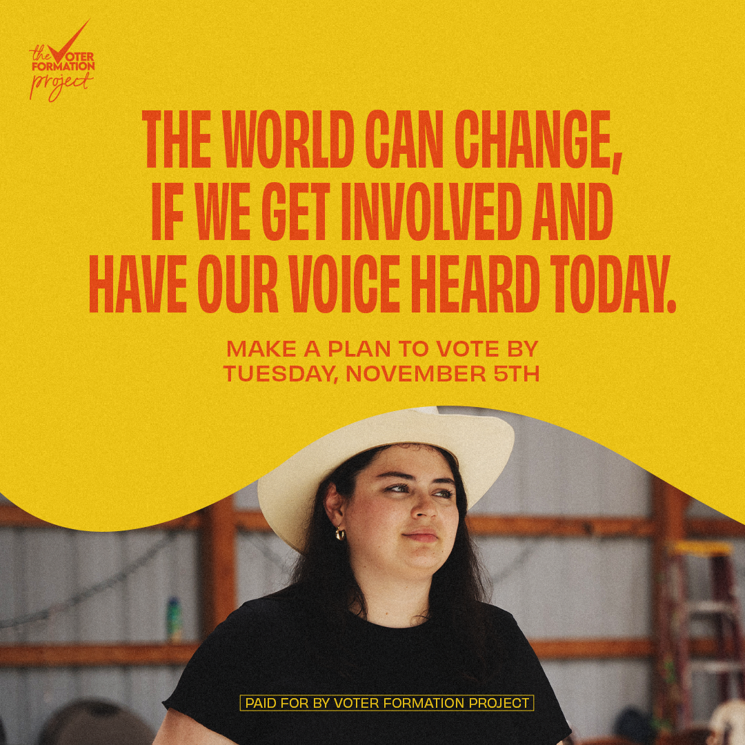
I wanted to create branding that resonated with Black audiences in a way that felt both welcoming and familiar. Black communities and especially low propensity voters are already disengaged from the civic and political process. VFP wanted our content to feel like enjoyable content that the audience consumes with the goal of our content seamlessly intertwining into their daily lives. Voting and politics should feel as natural and essential as any other act of self-care or empowerment.
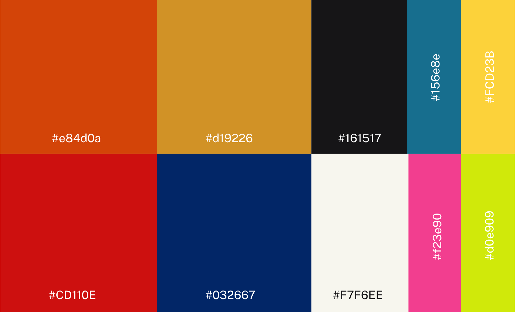
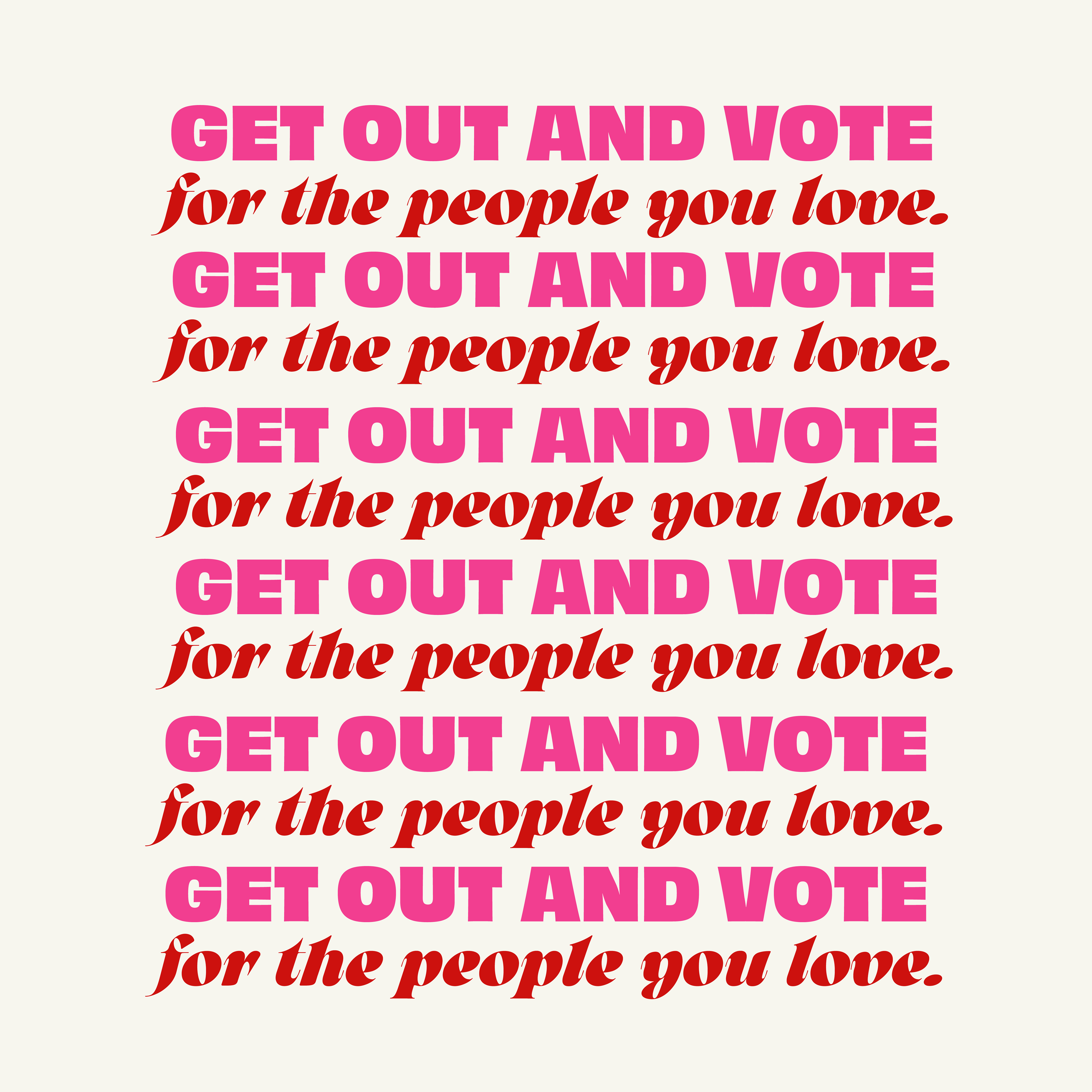
This color scheme strikes the perfect balance of depth, warmth, and vibrant pops of color to reflect the rich, complex history Black communities have with this nation. The typography—Obviously and Arsenica—allowed us to be both bold and approachable, blending blocky sans-serifs with more personal serifs. This approach gave our designers a solid structure while offering enough flexibility to make each design feel unique.
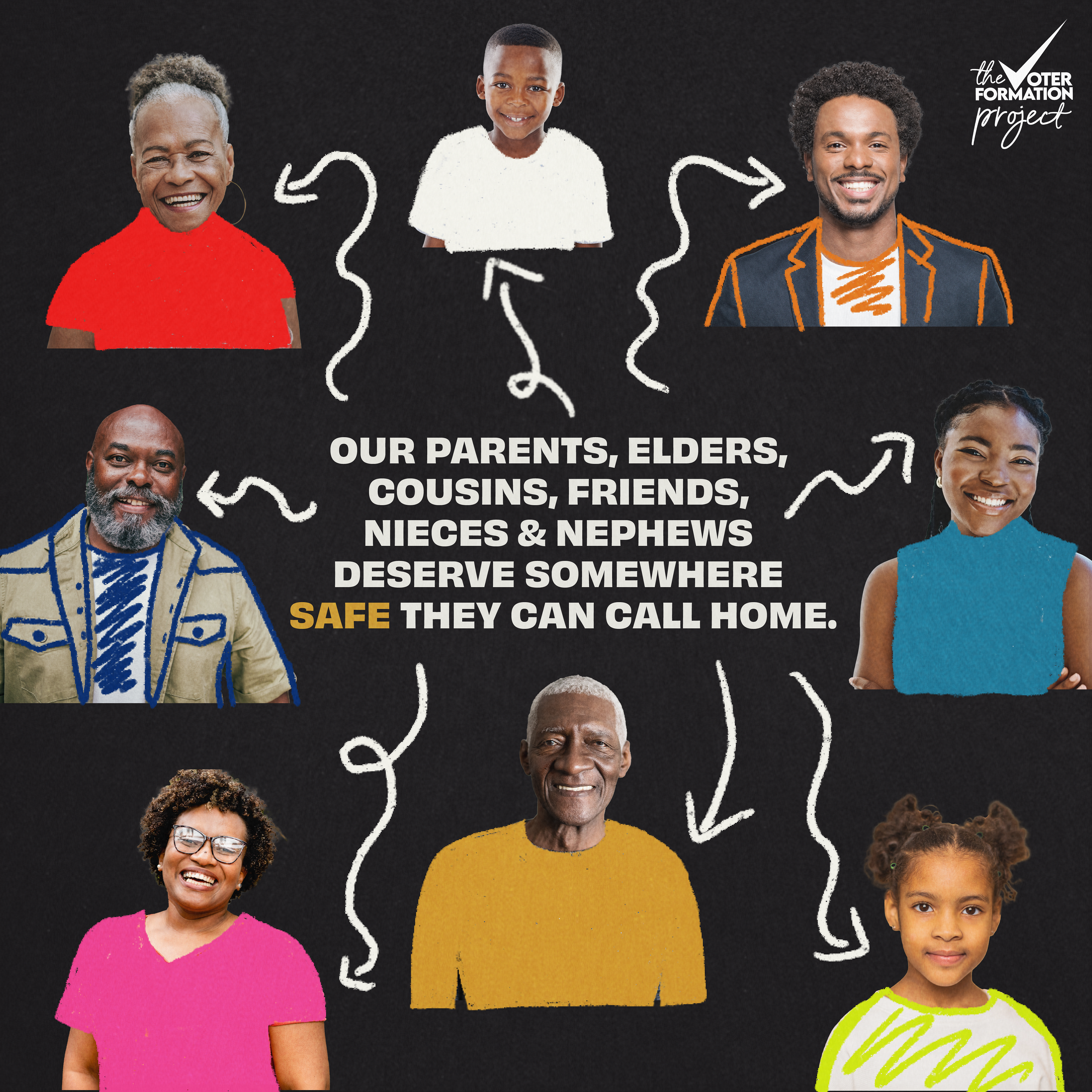
graphics created by Tiarra Lucas
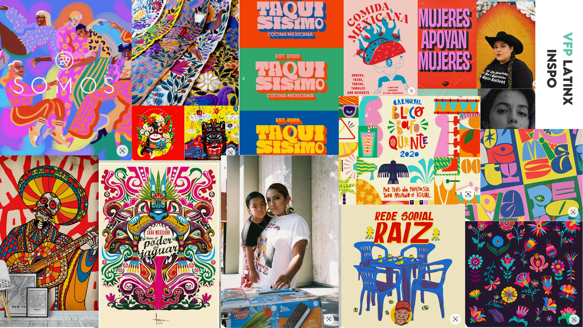
Speaking to a Latinx Audience
For our Latinx programming at Voter Formation Project in 2024, we aimed to create a brand that felt vibrant and rich. Our work was primarily focused on the Latinx community in Arizona, where a significant portion of the population has roots in Mexico. With this in mind, we drew inspiration from art styles that honor Mexican heritage and culture to shape our branding.
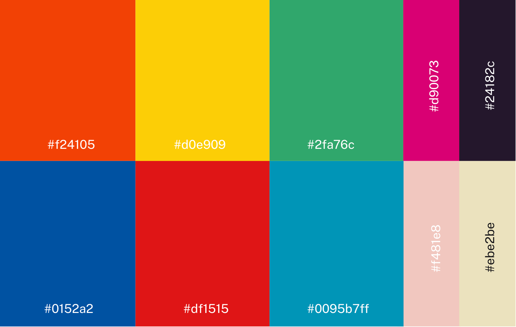
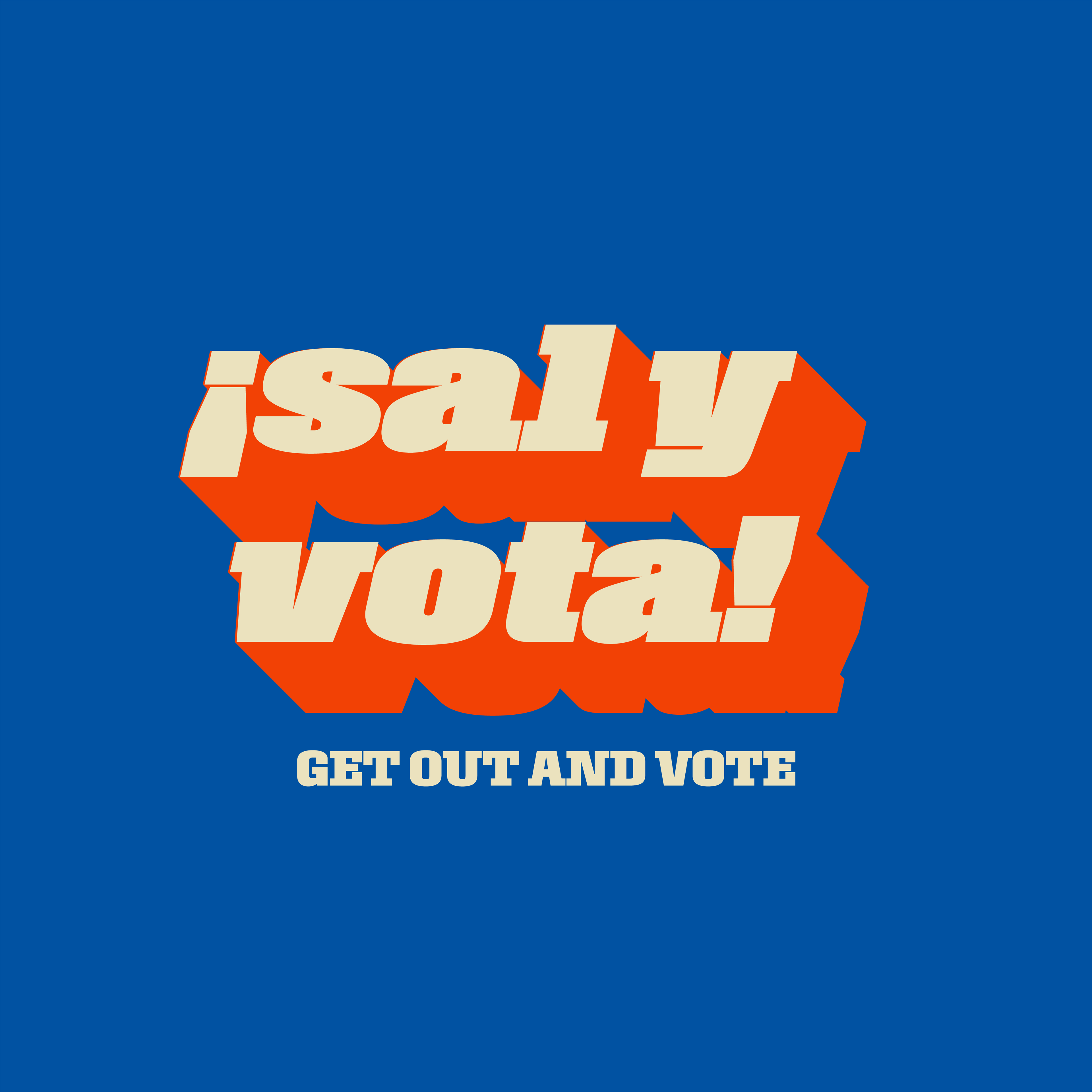
We embraced brighter, more vibrant colors to reflect the rich, colorful art of Mexican and Mexican American culture. For typography, we selected two bold fonts (Rooster and Obviously) that complemented the boldness of our color palette. This approach provided our designers with a clear structure while allowing them the flexibility to tailor their work for the audience.
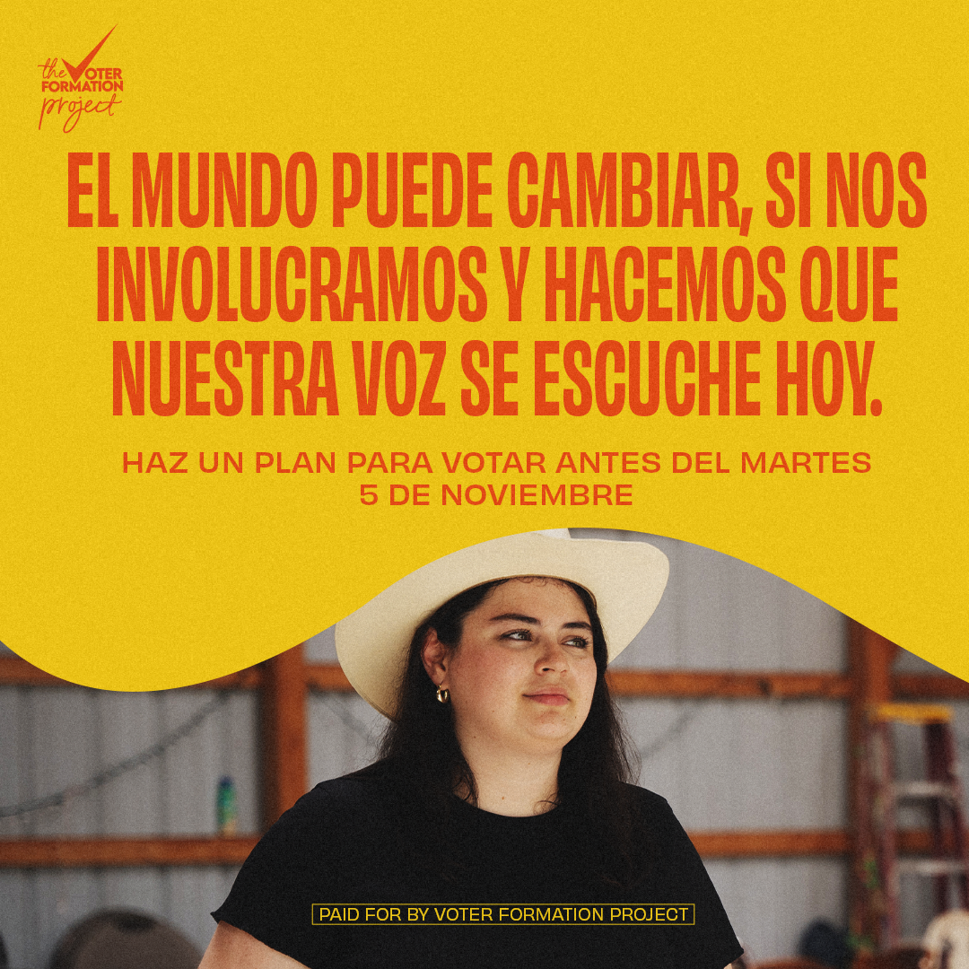
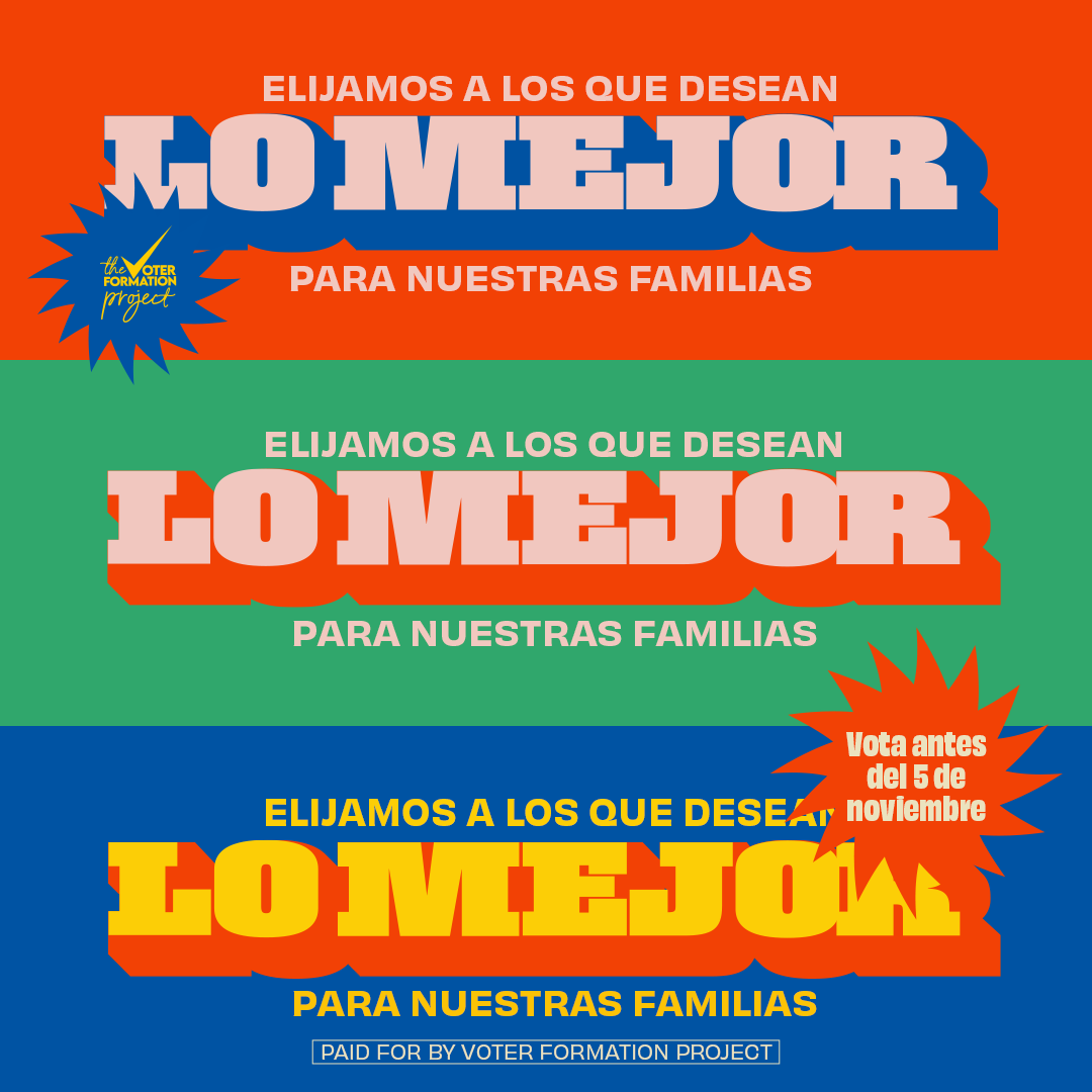
graphics created by A'lysia Alcorn
My role in this project
As Creative Director, I developed the creative direction for the brands centered on Black and Latiné audiences. Leading a creative team of two graphic designers and two video editors, I collaborated closely with them to produce all visual and video content, ensuring alignment with the established creative vision throughout the project.